
Dayton Outpatient Center
Logo Design, Rebranding
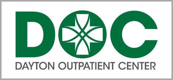
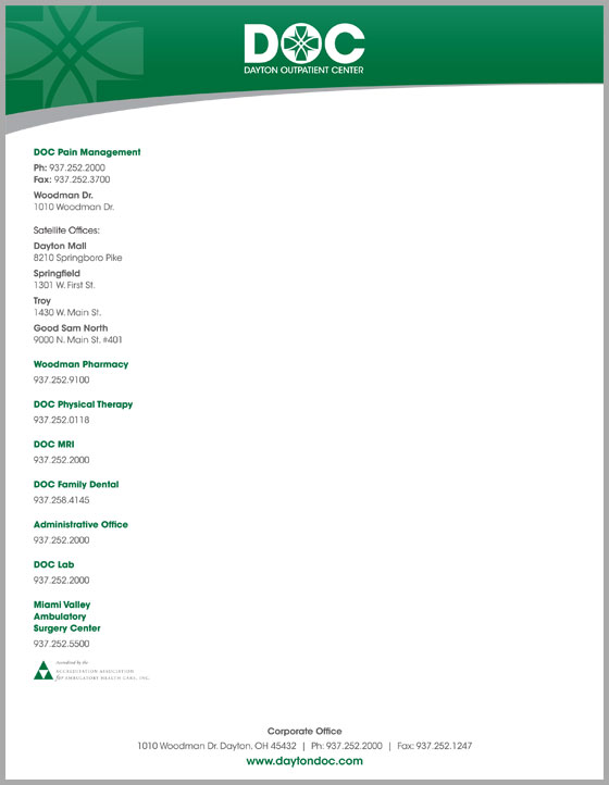
The Dayton Outpatient Center (DOC), an oupatient medical center, needed a logo redsign. I kept the medical cross from their old logo and implemented it into this new one for some brand consistency. By using the cross as the center of the "O" I could keep the logo clean and simple. The logo then influnced all other design for DOC as can be seen in both the letterhead and busniss card.